
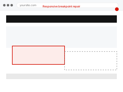
Responsive design relies on breakpoints — specific screen widths where the layout deliberately changes — and when the CSS at one particular breakpoint is missing a rule, has a conflicting one, or simply wasn’t tested at that exact width, the layout can break in a narrow band of screen sizes while looking completely fine just above or below it. That narrow-band pattern is exactly what makes it easy to miss during normal testing, since most people check a page at a few common widths rather than sweeping continuously across the full range.
Before you buy, one quick look
Read-only. Open your browser’s developer tools, switch to responsive design mode, and slowly drag the viewport width from wide to narrow, watching for the exact width where the layout breaks.
Noting that specific width, even approximately, turns a vague “it looks bad on my phone” into a precise, fixable target, and it’s genuinely useful information to have ready before ordering.
Checking whether the same width breaks the layout consistently across a few different pages using the same template also helps confirm whether this is a shared, template-level issue or something isolated to one page.
Responsive breakpoint repair
A page looks right on desktop but breaks at specific screen widths — overlapping text, cut-off images, elements stacking wrong. We repair the breakpoint.
- Full backup taken before we start
- If we can’t fix it, you get your money back
- We never ask for your own password
This or something else?
| The layout breaks at a specific, identifiable screen width or narrow range | This fix covers it |
| The mobile menu specifically is what’s not displaying or working | Menu not displaying or breaking on mobile |
| The problem is content readability generally, not a specific structural break | A different, broader mobile QA service |
| You want a full mobile and tablet sweep across the whole site, not one issue | Mobile & tablet viewport QA sweep, a different service |
| The layout looks fine everywhere except inside a specific page builder element | A different, builder-specific display fix |
What you are seeing
- Text overlapping, images cut off, or elements stacking incorrectly at certain widths
- The layout looking correct just above and just below the problematic width
- The issue appearing on real devices as well as a resized browser window
- The problem isolated to specific pages, templates, or sections
- The issue starting after a theme update, content change, or new element added
Common causes
- A missing or incomplete CSS rule for one specific breakpoint
- Two conflicting breakpoint rules both applying at the same width
- Fixed-width elements not converting to flexible sizing at narrower widths
- Content, such as a long word or wide table, forcing layout beyond its container
- A theme update changing breakpoint values without updating custom CSS to match
What we do
- Identify the exact width or range where the layout breaks
- Inspect the CSS active at that specific breakpoint for the responsible rule
- Correct the missing, conflicting, or incomplete styling causing the break
- Test the fix across the full range of widths, not just the one reported
- Check other pages or templates using the same layout pattern
- Confirm correct display on real devices, not only a resized browser window
What is included
- The specific breakpoint issue identified and repaired
- Testing across the full range of screen widths, not just the reported one
- A check for the same pattern on other pages or templates
- The pre-fix backup, kept for 30 days
Not included
- A full mobile and tablet QA sweep across the entire site
- Redesigning the layout beyond restoring correct display at all widths
- Fixing a broken mobile menu specifically, which is a separate fix
- Ongoing testing as you add new content or sections in future
Questions about this fix
Do I need to tell you the exact pixel width, or is roughly enough?
Roughly is a fine starting point — we confirm the exact width ourselves as part of the diagnosis, so you don't need precision going in.
Will this fix affect how the page looks at other screen widths?
No — the fix is scoped specifically to the breakpoint where the problem occurs, leaving correctly-displaying widths untouched.
Could this be a specific device issue rather than a width issue?
It's possible, though most breakpoint problems reproduce consistently at a given width regardless of device, which is part of what we confirm during diagnosis.
Why did this only start recently if I haven't changed that page?
A theme update changing breakpoint values, or new content added elsewhere on a shared template, can surface a latent issue without you touching the affected page directly.
Does this cover tablets as well as phones?
Yes — we test across the practical range of widths involved, which includes tablet-sized viewports, not just the narrowest phone widths.
Related fixes
If this is the second time this year
A bad update breaking the site is a symptom of updates not being tested first. Care plans run every update on a staging clone before it reaches your live site, which is the actual fix for this happening again.
Your access, your rules
Create a separate admin account for us and delete it when we are done. For anything else, we get in touch and agree a method — never a form field on this site, never by reply to an email.
We back up first, always
Before anything is touched we take a full backup and keep it for 30 days. If a fix goes wrong, we put the site back exactly as it was.
If it is not what you bought
If the problem turns out smaller than what you ordered, we refund the difference. If it is bigger, we stop and send a quote before doing any extra work.
If we cannot fix it
You get back what we received. Diagnosis is on us — you only pay when the problem is actually solved. The payment processor takes its fee before the money reaches us, so we never hold it and it is not ours to return. That is true here as everywhere else.
If it comes back
Reply within seven days of delivery and we put it back on the bench at no cost. The fix is not finished until it holds.
What we are responsible for
If something goes wrong with a fix, our responsibility is limited to what you paid for it. We take a full backup first so mistakes can be undone, and we tell you before doing anything outside what you bought.