
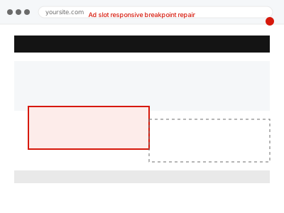
A responsive ad unit that works correctly on desktop can overflow its container, get cut off, or fail to load an appropriately sized ad on mobile, if the breakpoints controlling ad size don’t actually match how your site’s own layout responds at different widths.
Resize your browser window slowly and watch the ad slot
On a page with an ad, slowly drag your browser window narrower and watch the ad unit specifically — a size that suddenly overflows its container, disappears, or looks visibly wrong at a particular width points to a breakpoint mismatch at that exact size.
Ad slot responsive breakpoint repair
Ad units that overflow or vanish at specific screen widths, fixed to match your theme's actual breakpoints.
- Full backup taken before we start
- If we can’t fix it, you get your money back
- We never ask for your own password
This or something else?
| Ad units overflow, disappear, or look wrong at specific screen widths | This fix covers it |
| Ads cause layout shift as they load, not a responsive sizing issue | Ad-induced layout shift (CLS) correction |
| Ads aren’t showing at all, at any width | AdSense code placement & ad unit implementation |
| The whole site’s layout breaks at certain widths, not just ads | A broader responsive design issue |
What you are seeing
- Ad units overflowing their container at certain screen widths
- Ads appearing cut off or partially hidden on some devices
- An ad slot failing to show any ad at specific widths while working at others
- The issue possibly only appearing after a theme or design change
Common causes
- Ad unit breakpoints configured independently of the theme’s own responsive breakpoints
- A fixed-size ad unit placed in a container that doesn’t accommodate it at narrower widths
- Auto-sizing ad code conflicting with custom CSS controlling the ad container
- A theme update changing layout breakpoints without ad configuration being updated to match
- Multiple ad sizes configured for one slot with gaps between the size ranges
What we do
- Identify the specific widths where ad units break or misbehave
- Compare ad unit breakpoints against the theme’s actual responsive breakpoints
- Reconfigure ad sizing to align correctly across all relevant widths
- Test across a realistic range of device widths, not just common presets
- Confirm no gaps remain where an ad might fail to display appropriately
- Verify ad revenue and visibility are maintained across every width tested
What is included
- Ad units correctly sized and contained across all tested widths
- Verified alignment between ad and theme responsive breakpoints
- Testing across a realistic range of device widths
- The pre-fix backup, kept for 30 days
Not included
- Fixing broader theme responsive issues unrelated to ad units specifically
- Redesigning ad placement itself, a separate fix
- Ongoing adjustment as you change themes or redesign in future
- Guaranteeing a specific revenue outcome from the fix
Questions about this fix
Why would this only show up at certain widths and not others?
Because responsive ad sizing works in defined breakpoint ranges, a gap or mismatch between those ranges and your theme's own breakpoints only manifests at the specific widths caught in that gap.
Did a recent theme update cause this?
Possibly — a theme changing its own responsive behaviour without ad configuration being updated to match is one of the most common causes of this specific problem.
Will this happen again if I change themes later?
It's a real risk any time your site's own responsive breakpoints change without revisiting ad configuration to match — worth checking ad behaviour specifically after any future theme change.
Could this be costing me revenue even if it looks like a small visual issue?
Yes — an ad that fails to display or renders badly at a given width isn't just cosmetic, it's a genuine missed impression at every visit occurring at that width.
Is mobile or desktop more commonly affected by this?
It varies by site, though narrower mobile widths more often expose breakpoint gaps since there's less room for a mismatch to go unnoticed visually.
Related fixes
If this is the second time this year
A bad update breaking the site is a symptom of updates not being tested first. Care plans run every update on a staging clone before it reaches your live site, which is the actual fix for this happening again.
Your access, your rules
Create a separate admin account for us and delete it when we are done. For anything else, we get in touch and agree a method — never a form field on this site, never by reply to an email.
We back up first, always
Before anything is touched we take a full backup and keep it for 30 days. If a fix goes wrong, we put the site back exactly as it was.
If it is not what you bought
If the problem turns out smaller than what you ordered, we refund the difference. If it is bigger, we stop and send a quote before doing any extra work.
If we cannot fix it
You get back what we received. Diagnosis is on us — you only pay when the problem is actually solved. The payment processor takes its fee before the money reaches us, so we never hold it and it is not ours to return. That is true here as everywhere else.
If it comes back
Reply within seven days of delivery and we put it back on the bench at no cost. The fix is not finished until it holds.
What we are responsible for
If something goes wrong with a fix, our responsibility is limited to what you paid for it. We take a full backup first so mistakes can be undone, and we tell you before doing anything outside what you bought.